Sunday, December 11, 2011
Family Update
Just a quick note to say I probably won't be posting for a bit. The situation with my mother-in-law is deteriorating quickly. My sweet Mr. Wonderful and I are trying to be strong and help the rest of the family cope, but I must admit there are moments when we both feel overwhelmed. Your prayers are so appreciated as we walk this path. It helps more than you can know. Thank you all for your kind thoughts and comforting words.
Friday, December 9, 2011
Love You Tulips

One more card for Operation Write Home.
This card is probably fairly self-explanatory. The tulips were colored with colored pencils and blended with a Dove marker. The sketchy look is kind of an interesting change from the usual well-blended coloring achieved with Copics--a bit more "painterly".
I did highlight the tulips with a bit of Sakura Stardust pen in clear to add just a bit of sparkle. I just can't help myself, LOL.
Not much time today for more explanation, got to get these in the mail to OWH and then head over to Mom's. But if you have any questions, please leave a comment and I'll try to get back to you soon.

Wednesday, December 7, 2011
Dandelion Background
I find making my own backgrounds is strangely satisfying. I can use whatever colors, patterns or images I desire and the end result is uniquely mine. I think that's kind of fun.
Anyway, here's a simple card that illustrates how easy it is to make your own patterned paper. I must add that this card is a CASE from the very talented Suzanne Russell at Beauty and Blessings. Go check out her blog. She's amazing!

The background image was stamped with Desert Sand by Memento, using the dandelion-like image from Botanical Silhouettes. The stems and flowers in the foreground are from the same set, and were stamped using Ocean Tides (PaperTrey) and Bamboo Leaves (Memento). A little yellow glitter in the flower centers, adhered using Glossy Accents so there's no rub off, completes the first layer.
A smaller dandelion image was stamped on a scrap of white as before, then the sentiment was stamped using more Ocean Tides, then die cut with PaperTrey's Half and Half die. A mat of Ocean Tides cardstock was trimmed to match, and the two were adhered to the first layer. I decided not to use dimensionals here to avoid too much bulk.
Everything was matted with a piece of Ocean Tides, and then mounted to a white card base, after rounding the corners for a bit of softness. I'm thinking rounding only the lower, or perhaps opposing, corners might have been more interesting, but it is what it is.
Go try making your own background paper, but be warned--it's addictive! (Yeah, like everything about this crazy hobby isn't, right?)
Monday, December 5, 2011
Whimsical Birthday
Happy Birthday! Well, OK, maybe it's not your birthday, but it is a birthday card! So let's take a look...

This card was inspired by one by Suzanne Russell at Beauty and Blessings. Oh heck, let's be honest, it's darn near an exact copy--why mess with perfection, right? Anyway, you really should check out her blog. She's so inspiring! You can hardly tell from this picture, but the actual colors "we" used are pale aqua, avocado green and kraft. How is it that colors can turn SO weird at times? Oh well, on to the card.
I cut two rectangles each from the aqua and green, stamped the leaves (green on the aqua, white embossed on the avocado). The flowers were die cut from aqua and white, then stamped and popped on dimensionals. The sentiment was stamped then white embossed. I just love the crisp white that you get with white embossing. A bit of pearl from a Viva pen on the flower centers finishes them off.
I scored the kraft layer to fit the rectangles, then adhered the retangles. A white pigment pen from Ranger was used to doodle stitching around each rectangle. Kind of adds to the whimsical feel, don't you think? Anyway, the whole panel was then adhered to a white card base and another birthday card can be added to the stash! I don't know about you, but birthdays have a way of slipping up on me unprepared, so it's nice to have at least a couple I can use when life gets in the way of creative time. Know what I mean?
Hope you have a great day and get some time to get inky.
Saturday, December 3, 2011
Toile Love You
Hi everyone!
I had a few minutes today to get a little crafty. I really wanted to get some done for Operation Write Home. They are having a couple of drives for valentines and general "love" themes that will help provide shipping and cookies to the troops. I've been wanting to participate, but just wasn't sure I'd be able to, but today I got at least one done for the cause. Makes me feel better.

I had a few minutes today to get a little crafty. I really wanted to get some done for Operation Write Home. They are having a couple of drives for valentines and general "love" themes that will help provide shipping and cookies to the troops. I've been wanting to participate, but just wasn't sure I'd be able to, but today I got at least one done for the cause. Makes me feel better.

I had a couple of small rubber stamps that reminded me of the motifs you see in toile prints and I thought I'd try to use them to make a background paper. I stamped the images repeatedly in a fairly consistent pattern, then ran the finished background through the Big Shot using a textile embossing folder. The end result reminds me of a quilted bed cover. To highlight the embossing a bit, I lightly swiped it with Chai ink (PaperTrey), then adhered it to a bit of red cardstock.
The sentiment was stamped on a circle cut with basic circle nesties, then mounted on red that had been cut with an eyelet nestie. Another touch of red card stock, edged with Apron Strings (I think that's what it's called) border punch, and embellished with white satin ribbon, plus a little tag and sentiment tied on with a bit of twine finished this quick card.
So if you want to help Operation Write Home meet their goals, go check out their site and get crafty. The deadline, I think, is December 10, so time's awastin'! You'll feel great too, knowing you helped a worthy cause.
Thursday, December 1, 2011
A Homespun Christmas
Just checking in first to say thanks for your prayers for my mother-in-law and the family. Although Mom is currently holding her own--she's an amazing lady--the prognosis isn't good. We are providing hospice care and just taking things day-by-day. We are thankful for each day we have with her and try to remind ourselves that God never promised it would be easy. He did, however, promise to be with us and we're leaning on that promise.
Second, I had a few minutes today to actually try to make something and wanted to share it before too much more time slipped away.

Second, I had a few minutes today to actually try to make something and wanted to share it before too much more time slipped away.

This is just a simple, homespun Christmas card. Most of the supplies are PaperTrey, except the patterned paper, which was from my stash. The cute doubled ended flag is a die from PaperTrey, too. I think it adds a fun touch for the sentiment, and when popped up on dimensionals, it adds a bit of texture. A few buttons and baker's twine, and another card is ready for the stash.
Tuesday, November 1, 2011
Might be AWOL for a bit
Just wanted to let you know I may be missing around here for a bit. We checked my MIL into the hospital last night and the news isn't particularly good. Will be heading back up to the hospital shortly and it could be another 22 hour day.
But God is bigger than our problems, so we're going to trust in Him and soldier on. I would covet your prayers, if you're of a mind.
But God is bigger than our problems, so we're going to trust in Him and soldier on. I would covet your prayers, if you're of a mind.
Magical Christmas Reindeer

Hi gang! I have another Christmas card for you today. This one features a magical reindeer.
This reindeer was a favorite of mine last year--I really like the whimsy of the flowers streaming behind him and his coat of stars and flowers. I didn't note the manufacturer, but I think it was by Impression Obsession. Anyway, in this year's rendition, I decided to emboss him in Egyptian gold and color a few of those whimsical flowers with a Copic marker (BG75, I think). I stamped the "Merry Christmas" using chocolate ink, then matted it twice, once in Ocean Tides and once in Chocolate (PaperTrey).
The background was embossed with my trusty snowflake embossing folder and layered on a white card base. (I could just emboss the base, but I think it looks kind of messy on the inside that way. Just my preference--you're mileage may vary.) The patterned paper is an older scrap from a year or two ago that has a nice sparkly quality. Sorry, I don't remember who made it. I matted it with the Ocean Tides and Chocolate, mounted it one the snowflake piece, then mounted the reindeer atop it all. A few brads in the corner, and there you have it.
It makes me smile. Christmas should make you smile, don't you think? So, go make something that makes YOU smile! And remember the reason for the season, and the One who gave you the talent to make whatever you make in the first place! Merry Christmas!
Sunday, October 30, 2011
The Joy of Christmas

I made up my mind I was going to work on Christmas cards today, even if I wasn't in the mood. I don't know why I'm not in the mood. I usually love making Christmas cards. This year--not so much. Probably has something to do with caring for aging parents, watching too much news, and balancing my checkbook. Yep, that'll do it every time. But once again, I digress. Sigh.
OK, back to making Christmas cards. So anyway, I thought I'd see if I could come up with something fast. I bought this snowflake embossing folder at the end of the season last year, so it didn't see much action. I really like it, though, and who doesn't love embossed backgrounds? I mean, really! So, OK, I can emboss a background with the snowflakes, but then what?
Well, if you were here for the Operation Write Home Blog Hop, I made a Christmas card that was white-on-white, and had a frame cut out with dies. (What? You missed it? OK, check here, then come right back. You don't want to hold up the rest of the group, do you? LOL) I thought about doing something similar, but simpler. I was mindlessly thumbing through my label dies from Spellbinder, when this little guy jumped out--actually it did, it fell right out so, what the heck, I decided to use it! I layered the label die with a small plain square die on white card stock, ran it through my trusty Big Shot and in seconds, had a neat-o frame. After patting myself on the back, I realized I didn't have anything small enough to use as a focal point within the frame. Ack! What to do?
I don't know about you, but when I'm stuck, I just start thumbing through my goodies. This time, I stumbled upon this small holly leaf and sentiment. Eureka, just what I needed! So I stamped the leaf in green, added red Stickles for the berries, and stamped the "joy" in Versafine Onyx Black. (Love that ink for anything I want to have a clear, crisp image.) Then I just layered it to the snowflake embossed background, and layered again to a white card base! Yeah, another Christmas card for the ol' stash!
Thanks for stopping by today. Now go thumb through some of your goodies and see what little treasurers you come up with. It's fun!
Friday, October 28, 2011
Adventures with an Edge Die

I've been meaning to try using this edge die on a card base, but somehow I never remember to do it before I'm too far into a design. For you younger friends, before you snicker, remember you'll be old and forgetful one day, too!
Anyway, I wanted to make a Miss You card for Operation Write Home using this Floral Fusion stamp from PaperTrey. Since there's a die that matches the stamp, I began digging through my dies and lo and behold--there's that edge die I've been meaning to try. Well now, let's just give it a try, I thought. So I placed the die on my card base, cranked it through my Big Shot, and voila--a fancy shmancy bottom edge just like that! Very cool, actually. Don't know why it's taken me so long to try this--now darn it you young whippersnappers, quite your giggling!
OK, back to the card, I stamped the flowers in Fresh Snow onto citrus colored card stock scraps and cut them out with the matching die. Then I stamped the leaves/stems on the card base, adhered the flowers (the center one is popped up on dimensionals), and stamped the sentiment. Using a couple of Martha Stewart punches, I punched the solid butterfly from a scrap of orange paper, then punched the lacy butterfly in green and layered it on top. A little strip of green card stock, a yellow gingham ribbon and my card was starting to take shape. It still felt a little naked though, so I added a few dots of pearl with a Viva pen. Better--but still not enough. Hmmmm, well no respecting butterfly zooms about without a proper "zoom tail", so I added a bit of black pen work and solved that problem. Still a little unfinished feeling. As a final step, I decided to add more black pen stitches around the edge of the whole lot. OK, now it felt dressed!
Actually, though I really like the edge effect, I think I'd avoid edging the back of the card like I did here. The card doesn't stand up when it's opened, which might (or maybe not) be a problem. I had to prop it up to photograph it. But hey, it was my first time after all! So, get those edgers, border punches, or whatever else you've been meaning to try, out of the drawer and given 'em a try! You can have an adventure too, and never even have to leave home! How cool's that?
Wednesday, October 26, 2011
Art Impressions Thinking of You
As are most of my cards, this one is for Operation Write Home. I often think about the children of our deployed service men and women, and imagine how hard it must be to have their mom or dad gone for months or years and not really understanding why. This little guy made me think about that yet again and inspired this card.


I don't typically do scenics, not that I don't like them, but I don't feel I can do them justice. But this stamp from the Front & Back line at Art Impressions just spoke to me and I had to give it a try. After stamping the little fella, I colored him with Copics, then cut him out. I then stamped the fence on white card stock and colored it with Copics too.
It seemed like the little guy should be looking at something, so I found a tree stamp from PaperTrey's Through the Trees, and stamped it behind the fence (after masking off the fence ). Then on a whim I decided to sponge the sky and the grass. A few grass sprigs were stamped for good measure. Then I popped the boy up on dimensionals, matted the scene with chocolate card stock and adhered it to a yellow card base.
The sentiment was stamped on a piece of ivory stock in chocolate, then I cut the flag end with the edge of a square punch and added it to the scene with dimensionals too.
I hope it captures the heart of some deployed mom or dad who wants to let their guy know they think of him often. And I hope they let him know he's a little hero too.
Monday, October 24, 2011
Rustic Christmas
I'm a big fan of bling and sparkle for Christmas cards, so these cards were a challenge I made to myself to try to do something a little less "bling-y" (that's a real word, I'm sure!)
I started by stamping the branches in various shades of green on a piece of cream card stock. Then I sponged on some Spiced Marmalade, Mustard and a bit of Rusty Hinge distress ink. Quite a departure from what I normally think of as "Christmas colors." The sentiments were stamped in Chocolate Brown.

I started by stamping the branches in various shades of green on a piece of cream card stock. Then I sponged on some Spiced Marmalade, Mustard and a bit of Rusty Hinge distress ink. Quite a departure from what I normally think of as "Christmas colors." The sentiments were stamped in Chocolate Brown.

For the Joy to the World card, I tied on a piece of gold cording, then matted it in Chocolate Brown and mounted it on an Avocado card base.

For the Peace & Happiness card, I added a small gold snowflake brad, added some piercing, matted it with Terracotta Tile, then mounted it on a Kraft base.

Both cards were lined with cream cardstock that I'd stamped with more branches, and sponged slightly.
OK, I know I didn't quite make the challenge of no bling with the gold cording and snowflake, but I do think the cards have an interesting rustic feel nonetheless. My Mr. Wonderful commented that he kind of liked the fact they weren't in the usual Christmas colors. Even though they are quite different from what I normally think of for Christmas cards, I still think they work for the holidays. What do you think? Do you ever stray away from traditional Christmas colors for your cards? If not, go give it a try! (And if you want to use a little bling, I'll never tell.)
Saturday, October 22, 2011
Elegant Christmas
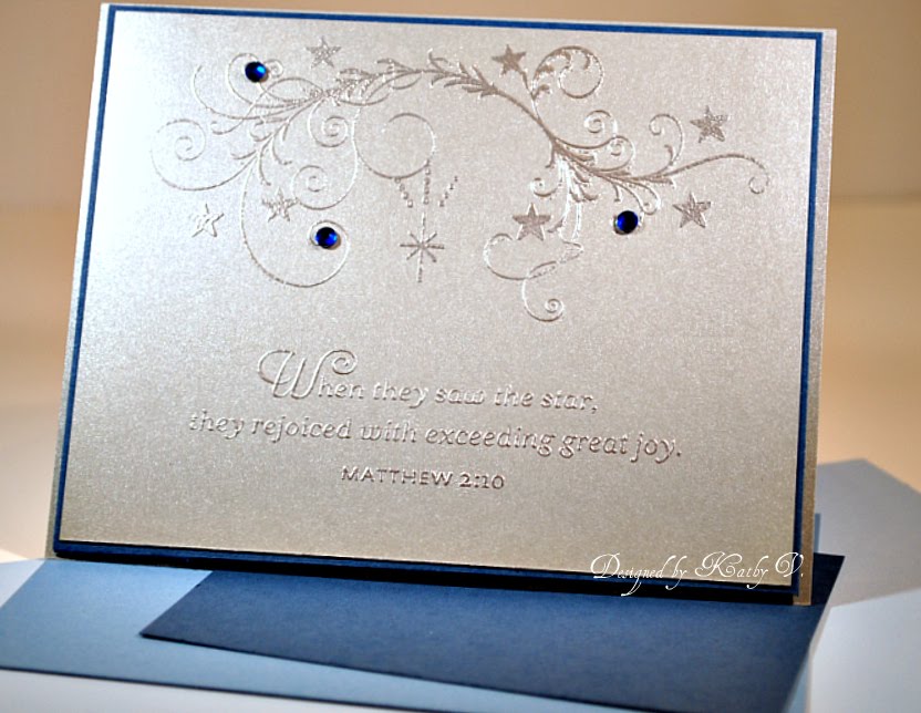
Hi friends! Today's entry is a fairly simple card that I've been planning in my head ever since I picked up this silver cardstock from PaperTrey.
Sticking to my clean and simple kick of late, I was thinking silver embossing on the silver cardstock might be kind of interesting. I really like this sentiment and the scroll (from PaperTrey) and simply stamped them in VersaMark, embossed with silver and added a few blue gems. I then matted with Enchanted Evening cardstock and popped the lot onto a silver cardstock base. It's unfortunate the sparkly goodness is so hard to capture in a picture. In real life it's quite pretty. Even my Mr. Wonderful liked it! High praise indeed. Or, maybe he was just hungry and figured that would get him dinner sooner! LOL
Go try something simple. You might just suprise yourself!
Thursday, October 20, 2011
Punched Flower Thank You

Have you noticed the card making world seems to be moving toward simpler, cleaner designs? I'm kind of liking that. Sometimes the more elaborate, multi-layered beauties just seem like--well, too much. That doesn't mean I don't like to use patterned paper, and lots of layers, and mega embellishments. But sometimes it's just refreshing to make something simple. Besides, some of those bulky, multi-layered cards can cost a fortune to mail and who knows if they arrive at their destination as pristine as when you mailed them, even if you pack them in bubble envies. I can just see the recipient opening a card and thinking, "hmmm, wonder what this was supposed to be?" Know what I mean?
Anyway, here's a little thank you that's clean and simple, and kind of fun. I used a flower die to cut out the flower shape from a piece of white card stock slightly smaller than the card base, then stamped the corresponding flower on the actual card base. After stamping the stems, I poked two tiny holes next to one of them and tied on baker's twine. Then it was just a matter of stamping the sentiment and mounting the die cut layer with dimensionals. Easy peasy.
Ok, that's it for now. It's your turn to get inky.
By the way, all the supplies used here are from PaperTrey, except the twine.
Tuesday, October 18, 2011
Thanks Just Not Enough
 Ok, I think I need a break from these blasted thank you's. This one is pretty self-explanatory--a bit of dotted designer paper, a label for the sentiment, stamped and colored with Copics, some faux stitching and a piece of ribbon. Quick and simple. Everything but the ribbon is from PaperTrey.
My one wish? That I could get the darn lighting better for my pictures! The greens look really off, but they do match in real life. How that happens is a total mystery. Must be little gremlins in the camera--yeah, that's the ticket! Ha! No wonder the pro's use those ginormous lamps for their photo shoots!
Thanks for stopping by. Go do something creative, and if you know how to take decent indoor pictures in crummy light, please leave me a comment! Of course, even if you don't, comments are always welcome.
Monday, October 17, 2011
Embossed Thank You

Just another thank you for the Mr. Wonderful to send. This one uses an older stamp from Magenta (I think) that I embossed in gold, then colored with ink and a waterbrush. I dry embossed a piece of rose cardstock, matted it with a piece of scarlet jewel, then swiped white ink over the edges to highlight the embossing. I added an embossed a strip of scarlet jewel, matted in white and attached the sentiment label that had been inked while still in the die (Spellbinders). A bit of green satin, and a few crystals and another card down.
Ahh, how many more did he say he needed? Yikes, better get busy. Sure would help if I could make more than one of a card. Naw, that would be boring....
Ahh, how many more did he say he needed? Yikes, better get busy. Sure would help if I could make more than one of a card. Naw, that would be boring....
Friday, October 14, 2011
Make Your Own Designer Paper

I often find myself studying designs I see in papers or elsewhere and trying to figure if I can duplicate it using stamps and supplies I have. This card is an example of such an attempt. The original inspiration piece was from some storage pieces at Target, and while I didn't buy them, I did "borrow" from them. Uh oh, hope that's not a crime--design snitching or something? LOL Anyway, here's what I did.
Using a Spring Moss piece, I stamped the large daisy-like flower using matching ink, then filled in the center using Fresh Snow ink. The small flowers were stamped in Aqua Mist, and the centers filled in with white pigment pen. The die cut label was stamped with leaves in Spring Moss, and the flowers were added using the Aqua Mist again, then the centers were filled with pearl pen. The butterfly and label for the sentiment were cut from Aqua Mist cardstock, and the butterfly was stamped with the small flowers in the same color. I also add a bit more of the pearl pen to the butterfly's body. After stamping the sentiment and embossing in white--love that sharp crisp look of white embossing--I added a couple of brads and ta da! Another card for the stash.
So, are you inspired by some pattern or design? Try recreating it with your supplies (come on, you know you have a ton of them) and see what you can come up with. It's fun, it's creative, it's cheaper than buying more paper! (Wink, wink) Go get creative.
Wednesday, October 12, 2011
Water Colored Thank You
Hope you're having a good day. It's been raining and windy all day here, but that did help me get some time in the craft room so I guess it can't all be bad.

I needed to make some thank you cards for Mr. Wonderful and spent all day trying to come up with a decent idea. This one started out with the stamped and embossed image that I colored with water colors. I thought I'd play up the turquoise, so I searched my stash and found the striped paper that has the same colors a the image. (By the way, the foliage in the image looks weird, but it really does match the bow.) I felt the turquoise cardstock needed a little something. A dotted embossing folder took care of that. Then to hide the seam, I cut a scalloped border. The sentiment was stamped on a piece of cardstock and cut out with a Half & Half die from PTI. It seemed a little to turquoise, so I added the green dotted ribbon. I lined the inside and added bits of the striped paper for contrast.
I don't know--something's still missing. But you know, sometimes you can spend too much time analyzing. Sometimes you just have to move on. So I am.
Sunday, October 9, 2011
Sending Smiles
I know a lot of you have stashes of papers and who-knows-what-else laying around and it's a challenge sometimes to get these supplies used. Me too! So today's card was an attempt to use some DP that I've had for quite some time--BasicGrey's Lilykate. I really love this paper, and I'm not sure they still make it, so I've been hording it. Like what--I'll never find another paper I love as much? Unlikely, in fact I've got my eye on a number of new releases--I know, fickle, huh?
So, anyway, I took a deep breath, started trimming up a piece of my fav from the collection, and you know what? Using it on a card is a lot more fun than keeping it on the shelf!

So, anyway, I took a deep breath, started trimming up a piece of my fav from the collection, and you know what? Using it on a card is a lot more fun than keeping it on the shelf!

Since I was on a roll with things I love, I dug out my new PTI Picket Fence die, and cut out the cute little fence. Then to add a bit more dimension, I die cut a scalloped label in white, stamped the flowers and stems, then die cut a blossom from blue cardstock and stamped it with its matching stamp. A button tied with twine was adhered with a pop dot, then the whole thing was adhered to the fence.
Using a piece of Lilykate that I'd adhered to white cardstock (to give it a little more stability), I stamped the butterfly then trimmed it out with my micro-snips. Finally I added a few black pearls as "nails" in the fence and a center in a flower, and added black faux stiches around the edge. I matted everything on a piece of white cardstock, then to a PTI Lemon Tart card base.
Using a piece of Lilykate that I'd adhered to white cardstock (to give it a little more stability), I stamped the butterfly then trimmed it out with my micro-snips. Finally I added a few black pearls as "nails" in the fence and a center in a flower, and added black faux stiches around the edge. I matted everything on a piece of white cardstock, then to a PTI Lemon Tart card base.
Ahhhh, much prettier than just sitting on a shelf, don't you think?
Supplies used:
Cardstock: Papertrey white, Lemon Tart, Spring Rain
DP: BasicGrey Lilykate
Stamps: Papertrey Floral Fusion 6, Sending You (sentiment); Magenta butterfly
Ink: Papertrey Enchanted Evening; VersaFine Onxyblack
Dies: Papertrey Picket Fence, Limitless Layers, Floral Fusion 6
Embellishments: button, twine, black pearls
Friday, October 7, 2011
Wildflower Garden
Do you ever find yourself returning to the same stamp over and over? I absolutely love this image from the Wildflower Garden set, and I can't seem to resist using it often. Perhaps because it lends itself to a number of techniques, like this distress ink "smoosh stamp" technique (see this post for more information on the technique).

In this rendition, I was inspired by some scraps of designer paper I had on my table. I wanted to make a card for Operation Write Home that could be sent to either a male or a female, and I think the stripes, dots and colors are gender neutral enough to work for either.
Anyway, I actually put the card front together before I considered what I'd use for my focal point and was stumped for a minute until I remembered this weed image from Wildflower Garden. I think the distress ink technique adds a nice softness to the rather stuffy stripes, and the colors help tie everything together. I added a bit of paper piercing to the corner for a little detail, and tied it up with gold cording (another go-to favorite!), before popping the focal on with dimensionals.
What do you think? Will it work for either a guy or a gal? Guess it depends on the eye of the beholder, but it works for me!
So, how do you make gender neutral cards? Got any tips to share? Would love to hear your comments.
Oh, by the way, in case you're curious, here's the supplies list for this card:
Cardstock: Papertrey Ocean Tide, Ripe Avacado
DP: Die Cuts With A View Linen Closet 8x8 pad
Stamps: Papertrey Wildflower Garden
Inks: Ranger Distress Inks Tumbled Glass, Faded Jeans, Peeled Paint, Shabby Shutters
Wednesday, October 5, 2011
Shabby/Chic Botanical Silhouettes
Does anybody else stuggle with shabby-chic or distressed types of cards? There are some amazing designers and card makers out there (Betsy Veldman comes immediately to mind) that have turned this style into an art from. Sigh...their work is so lovely.
On the other hand, I really struggle with this style. I don't know--it's something about the ink distressing or the multiple DP layers, or maybe the multiple details that always comes out, well, wonky.
Nonetheless, I wanted to try making a card using this style again (remember--practice makes perfect?) and here's what I came up with.

I was going for a sort of "Grandma's kitchen" kind of look so I started with a couple of design papers that reminded me of old fashioned kitchen designs. I layered them on a piece of Scarlet Jewel cardstock, then diecut a scalloped circle in green designer paper and attached it where to other two papers met. To cover the seam, I added a ribbon in Itty Bitty Dots Scarlet Jewel.
The focal point was made by stamping the flowers, stems and sentiment on a piece of cream cardstock. Because the designer papers had a slightly distressed look to them, I distressed the edges of the focal with Chai ink. I then layered the cream piece with a piece of the stripped DP and attached it to the card front.
I felt it could still use a little something, so I decided to add pearls to the scallops of the die cut mat, and a tiny pearl to center of each flower. Too much? Not enough? Hmmm, I'm not sure. But, of all my attempts so far, I think I like this one the best. Huh, maybe there is something to that "practice, practice, practice" stuff! LOL
Have you practiced a technique or style that's been giving you fits lately. Whatcha' waiting for? Go ahead, you can do it!
Cardstock: Papertrey cream and Scarlett Jewel
Designer Paper: Making Memories 8x8 English Garden pad
Stamps: Papertrey Botanical Silhouettes
Ink: Papertrey Scarlett Jewel & Ripe Avocado
Tools: Spellbinders Eyelet Circle
Embellishments: Pearls from stash, Papertrey Scarlett Jewel Bitty Dots
Cardstock: Papertrey cream and Scarlett Jewel
Designer Paper: Making Memories 8x8 English Garden pad
Stamps: Papertrey Botanical Silhouettes
Ink: Papertrey Scarlett Jewel & Ripe Avocado
Tools: Spellbinders Eyelet Circle
Embellishments: Pearls from stash, Papertrey Scarlett Jewel Bitty Dots
Friday, September 30, 2011
Operation Write Home Blog Hop
Welcome to the Operation Write Home Blog Hop! It's my first time participating and I'm excited to join in the fun! Supporting OWH is fast becoming a passion. I mean, how often can you do something you truly enjoy and benefit someone else in the process? The thank you letters OWH receives from grateful soldiers and their families are more than enough to let you know there is great power in a handmade card, especially one made with love and gratitude.
Our challenge for this hop was to create a holiday card without glitter! Say what!?! A holiday card without glitter? I'm sure there's a law against that somewhere!!! Yikes, talk about pressure!
But remebering these cards are for our troops, and we want to keep them safe, I put on my thinking cap and came up with an idea. Clean and Crisp! That's the ticket! Oh, you want to see what I came up with? Ok, here you go:
But remebering these cards are for our troops, and we want to keep them safe, I put on my thinking cap and came up with an idea. Clean and Crisp! That's the ticket! Oh, you want to see what I came up with? Ok, here you go:

Here's a closer peek at the details. (And, yes Virginia, that is a little bling--but it isn't glitter! LOL)

So, there you have it. Clean and Crisp, with just a touch of bling. By golly, maybe it is possible to make a Christmas card without glitter! Who'd a thunk? (Wink, wink).
They asked us to keep these posts short, so that's it from me. If you have any questions on my card or would like a quick tutorial, just leave me a comment. You're welcome to look around a bit, or continue hopping and enjoying the other amazing creations my fellow bloggers have in store for you! Either way, thanks for stopping by!

Thinking of You with Floral Fusion 8
I've been noticing that OWH seems to always need generic Thinking of You or Missing You cards. So even though we're all busy preparing Christmas and other holiday cards, I thought I'd take a moment and create a simple Thinking of You to add to my next package to OWH.

 |
| Sorry for the funky photo. I'm STILL working on that! |
I recently received a new stamp and die set from Papertrey called Floral Fusion 8 that was begging to get inked up. The set consists of a positive and negative flower, a stem and a couple of cute sentiments. For my card, I decided to use the both flowers and the stem. I die cut the flower shape in Hibiscus Burst, then stamped the negative floral image on the die cut in Fresh Snow. Next I cut a mat from white cardstock using Mat Stack 4, and stamped the stem in Ripe Avacado and the sentiment in black and matted with black cardstock. I attached the stamped die cut flowers to the stack with pop dots and set it aside.
Next I matted a piece of Bitty Dot in Hibicus Burst in black, added a bit of white cardstock edged with a border punch, and tied on a piece of Hibiscus Burt Ribbon. After attaching to a white card base, and adding the focal piece, I added three small black pearls and voila', a Thinking of You card is born!

If you look closely, you'd see there's a flower stamped inside. I used the positive flower image and the stem to repeat the front motif inside the card. I like to do this when I can. I think it elevates an otherwise simple card to something a little more special. Do you decorate the inside of your cards? I'd love to hear what other ideas you have for making your cards just a little more special.
Ok, that's it for me today. If you need a break from making holiday cards, why not try adding a few Thinking of You or Missing You cards to the stash? It's good for the soul!
Supply list:
Cardstock and Designer Paper: Papertrey
Stamps: Papertrey Floral Fusion 8, Sending You (sentiment)
Ink: Papertrey Hibiscus Burst, Ripe Avacado & Fresh Snow, VersaFine Tuxedo Black
Other: Fiskars border punch, Papertrey Floral Fusion 8 Die, hibiscus burst ribbon, black pearls
Thursday, September 29, 2011
Masculine Card Using Magenta Scenic
Why is it making cards for men can be so challenging? I guess it's one of those mysteries of life, but for what ever reason, I always dread making cards for men. Instant brain cramp. Know what I mean?
Well, recently I needed to make a card for a friend's birthday. I struggled coming up with an idea, and then I remembered this little scenic stamp by Magenta. I've always liked it, but could I turn it into a man-card (not to be confused with a man-cave, but I digress). Once I started thinking about it an idea began to gel in my mind, and lo and behold, the actual card came together relatively quickly. Go figure!

I started by stamping the Magenta scene and coloring it with Copic markers. I then trimmed it, and added a kraft mat. Next I stamped the text background on a cream piece of cardstock, distressed it a bit with Chai ink and matted it with black cardstock. I trimmed a piece of kraft stock slightly smaller than the cardbase, embossed it with a houndstooth embossing folder, and matted it with black. After tying on a black and cream ribbon, I added a green button and adhered the whole thing to a cream card base. Finally, I stamped the sentiment and frame (PaperTrey's Little Labels) on to a scrap piece of kraft, timmed it and adhered it with pop dots.
Not too bad. And guess what? Our friend liked it too! So now I can relax until next year. Next year? Yikes.
Ok, now it's your turn to go overcome a creative stumbling block. You can do it!
Tuesday, September 27, 2011
Flower Power with Floral Fusion 1
I know some people get sick of flowers. Me--nope, can't say I do. LOL I think they're always appropriate, and they just plain make me happy.
Here's a little flower card I made that was easy, and the results are bright and fun. Want to know how I made it? Ok, I'll tell ya!

(All the supplies used are from PaperTrey Ink, unless stated otherwise.)
I started with a plain white 51/2 x 4 1/4 inch card base (A2 size), and adhered a piece of Ripe Avacado cardstock, trimmed to 5 3/8 x 4 1/8. On another piece of white cardstock (trimmed to 5 1/4 x 4) I stamped the leaves from Floral Fusion 1 about an inch or so from the bottom, using Ripe Avacado ink. To add interest, I made sure the leaves were zig-zagged rather than straight across, and that some of them were stamped off the paper. Next I stamped the sentiment from Sending You in black VersaFine ink and tied on a Ripe Avacado saddle stitched ribbon.
Here's a close up of the flowers.


To make the make them, I die cut them using the matching Floral Fusion 1 die using a coaster. This particular coaster stock from PaperTrey cuts beautifully with their dies and adds a little something that cardstock alone can't match. And it stamps beautifully too, which is what I did next.
Using the matching stamp from the Floral Fusion 1 set, I stamped each die cut alternating between Orange Zest and Raspberry Fizz. (Who said orange and hot pink clash??). Then I applied the finished flowers to the tops of the stems with pop dots. For a final touch, I added twine to Orange Zest and Raspberry Fizz buttons, and attached them to the flower centers with glue dots.
See, I told ya--simple. Bet you could do it too. Whatcha' waiting for? Go give it a try and thanks for stopping by!
Monday, September 26, 2011
Autumn Abundance
Today I thought I'd share another card I made for Operation Write Home with a fall theme.
For me, sometimes all the fall colors can start too feel a bit too much. On this card, I thought I'd try mixing kraft and white, with just a touch of fall color. (Please excuse the fuzzy picture. So much to learn, so little time...)

A pretty simple card, actually, but I think it expresses the season. What do you think?
Thanks for stopping by. Now go do something creative!
For me, sometimes all the fall colors can start too feel a bit too much. On this card, I thought I'd try mixing kraft and white, with just a touch of fall color. (Please excuse the fuzzy picture. So much to learn, so little time...)

The focal stamp is from Papertrey's Autumn Abundance and colored with Copics. It was then cut out with a circle Nestablities, then matted with a kraft piece, also cut out with a Nestie. To add a little interest to the white background, I embossed it with a plaid impression plate from Papertrey. Finally I tied on a little twine (which seems fall-ish to me) and added a small tag using Papertrey's Tiny Tags die. Love that little heart the die cuts. I simply added a scrap of orange behind the heart to pop it a bit, the adhered the whole lot to a kraft card base.
A pretty simple card, actually, but I think it expresses the season. What do you think?
Thanks for stopping by. Now go do something creative!
Saturday, September 24, 2011
A Study in Orange
Hello there. Thanks for stopping by.
Today I wanted to share a card I made playing with scraps. Oranges can be challenging for me, but I think that repeating the colors throughout the design, and adding a good dose of white, helped pull this together. There's a good bit of pattern, but most of it is monochromatic, so it doesn't slap you in the face. Now what I mean?

Today I wanted to share a card I made playing with scraps. Oranges can be challenging for me, but I think that repeating the colors throughout the design, and adding a good dose of white, helped pull this together. There's a good bit of pattern, but most of it is monochromatic, so it doesn't slap you in the face. Now what I mean?

The focal was stamped with distress inks in various shades of yellow, orange and greens. The butterfly was added for dimension. All in all, I'm fairly satisfied with this, especially since the colors are a bit out of my comfort zone.
So, tag--you're it. Go do something creative! And have a great time doing it!
Friday, September 23, 2011
Think of the Possibilities
It's kind of strange, but I rarely make the same card twice. I admire people who can do that. It would be so much more efficient when making cards enmass. But me--not so much. Perhaps it's a little OCD or something, but I digress. LOL
Anyway, once in awhile there's a technique or design that just captures my imagination. Now don't misunderstand, this doesn't necessarily mean the results are all identical, but it does mean I repeat the same basic technique several times, playing with a variety of possibilities. Maybe it's easier to show you what I mean. Take a look at this first sample.

This card was created by masking off the edge of my cardstock, then sponging distress ink along one side, letting it fade off toward the middle. I then stamped the floral image repeatedly in black without reinking between, and added the sentiment. A bit of black matting, and a ribbon added to a green card base and there you have it. Simple. Kind of cool. And it got me thinking.
My next attempt was in shades of aqua. I added a few raindrops and a bit of twine to add a bit more interest.

So I say to myself, "Hmmm, that's kind of neat. Still a little plain, but I'm seeing possibilities. Wonder if I can bump it up a bit more?"
And here's what I came up with.

This time I used multiple colors of distress ink for the sponging. The focal was cut out, then edged with a gold leaf pen. I adhered it to a white piece of cardsock, then matted it with black. Hmm, I'm starting to like this. Next, I embossed the aqua background piece, and matted that in black, adhered the focal with pop dots, then tied on a bit of gold cording. Finally, I adhered the whole lot to a white card base, and by golly, I think this has possibilities!
So, how about you? Do you get excited about a technique, a color combination, or a particular stamp and just experiment with it's possibilities? Give it a try. It's fun and who knows, you might come up with an amazing piece of art (or maybe just a nice card, LOL).
Thanks for stopping by. Have an inspired day.
Thursday, September 22, 2011
Fall is in the Air
I love the look of background text. I think it lends an air of romance to a card.
Here's a card I made using a background text stamp in Versamark on kraft. Unfortunately, the text stamp is an unmounted rubber stamp I picked up somewhere along the line and never thought to label with the maker's name. Oops. Another lesson learned.
I stamped the jar and flowers (from PaperTrey's Friendship Jar and Friendship Jar Summer Fillers) with Versamark and embossed with white embossing powder. I detailed the jar with W2 Copic, then colored in the leaves and flowers with Copic markers (sorry, I forgot to note the colors I used).

Thanks for stopping by. Get out and try something creative today!
Here's a card I made using a background text stamp in Versamark on kraft. Unfortunately, the text stamp is an unmounted rubber stamp I picked up somewhere along the line and never thought to label with the maker's name. Oops. Another lesson learned.
I stamped the jar and flowers (from PaperTrey's Friendship Jar and Friendship Jar Summer Fillers) with Versamark and embossed with white embossing powder. I detailed the jar with W2 Copic, then colored in the leaves and flowers with Copic markers (sorry, I forgot to note the colors I used).

The mat under the sentiment is cut with Papertrey's Half and Half die, then stamped in Summer Sunrise. I drew the orange stripes using a ruler and a Copic marker. The sentiment was stamped on white cardstock, then cut with the Jar Label die from PTI. I then adhered the finished piece to a cream card base with pop dots.
Makes a nice love note for Fall, don't you think?
Sorry about the funky lighting in this photo. I'm still trying to get that right! What do they say? Oh yeah, practice makes perfect. Looks like a little more practice is in order.
Thanks for stopping by. Get out and try something creative today!
Wednesday, September 21, 2011
PaperTrey's Fruit Fusion Apple
Welcome back.
Here's a little something I've been thinking about for a while for my Operation Write Home cards. I wanted to make something a soldier could send home that had a little something extra. I figured, sometimes they might want to send a little gift, but it's not like they can just run to the mall. Know what I mean?
Anyway, I came up with this idea. I thought the tag would make a cute bookmark. The sender could even add a little note on it to make it more personal. Whatcha' think?

I cut out the pocket with PaperTreys seed packet die, then stamped the inside with Text Style and the Apple image from Fruit Fusion: Apple. I cut out the bookmark, rounded the corners, then stamped the sentiment and apple image (Fruit Fusion again), tied on a ribbon, and there you have it.
Thanks for stopping by today. Have an inspired day.
Tuesday, September 20, 2011
Adventures with Distress Ink
I don't know about you, but I love distress inks. They are so versatile.
Here's a sample I made using what I call the "smoosh and stamp" method. I simply applied various distress inks directly from pad to my craft sheet (being careful to place the ink close to each other but not touching), pressed and smooshed my stamp into the ink, spritzed it lightly with water and stamped it on my cardstock. I stamped the sentiment, scored a couple of line on the left, and tied on the ribbon. Then it was simply a matter of matting it up with green card stock and applying it to my blue card base. Pretty simple, but it has a nice watercolored look, don't you think?

Here's a sample I made using what I call the "smoosh and stamp" method. I simply applied various distress inks directly from pad to my craft sheet (being careful to place the ink close to each other but not touching), pressed and smooshed my stamp into the ink, spritzed it lightly with water and stamped it on my cardstock. I stamped the sentiment, scored a couple of line on the left, and tied on the ribbon. Then it was simply a matter of matting it up with green card stock and applying it to my blue card base. Pretty simple, but it has a nice watercolored look, don't you think?

Definitely a technique I'll be trying again. How about you?
Thanks for stopping by today. See you again soon.
Subscribe to:
Posts (Atom)